Digital Product Design Principles
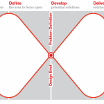
1. Define the problem first
Digital design always solves a problem, otherwise it would be pixel art. Understanding the problem thoroughly is essential to design successful solutions. When discussing the product and design internally, always define the problem first before proposing solutions. Thoroughly research the problem before coming up with suitable solutions.
2. Create more value by creating less
Simplicity is the key to great user experiences. Create fewer features, but make them great instead of just good. Show fewer elements, use simplistic styling to reduce cognitive load. Dare to say ‘No’ to prevent the core functionalities from being lost in the noise.
3. Design performs
Good design helps the company achieve its business goals. A design is successful when conversion and engagement are getting measurably better. Insights into product performance is key, they should be easily accessible for everyone in the company to make everyone understand which problems are worth to be solved.
4. Strive for consistency
Be consistent with layouts, design elements, typography and interaction to reduce the cognitive load for the user. Use the style guide as a box of legos where you can take the pre-defined building blocks to create consistent user experiences. We are not designing screens or features, we are designing a platform agnostic service with a consistent user experience.
5. Focus the user on one primary action at a time
Guide the user by focusing screens, views or actions on one primary task. Be ruthless with the prioritization, make the choices stupidly simple. Limit distraction. All elements and styling that are not helping the user focus on the primary task can be considered as visual clutter and a huge distraction for the user. Be aware that everything in the interface has to be processed by the user’s brain, the less there is to process the lower the cognitive load is.
6. Minimize user input
User input takes a lot of effort and time. Always strive for the least amount of user input to reach a goal. Every input that is required from the user increases the friction that the user experiences and increases the chance on giving up.
7. Use your user’s language
Words can both clarify and confuse users. Choose the language your users are using. Choose clarity and be concise. Descriptive and helpful is the primary aim, adding personality secondary. Don’t sound like a system, we are all humans.
8. Make decisions for the user
Don’t be afraid to make decisions for the user. Offering less choice and options will give the user a more confident feeling, because there is less to worry about. Be aware of the paradox of choice; offering a lot of choice will make the user feel overwhelmed because he/she needs to asses each and every option if it meets his/her goal.
9. Design with strong visual hierarchy
There are many ways to create visual hierarchy in a design, position, size, color, space. Determine a strict visual hierarchy in every design. Don’t let elements, actions or features compete for attention.
10. Align elements
The easiest way to accomplish visual balance is to align elements and structure designs with a clear grid. It guides us in the right direction when placing elements and determine dimensions, and it makes it easier for the user to process the interface.
11. Don’t go for ‘WOW’, go for ‘of course’
Never chase the ‘wow-effect’. Product design succeeds when it solves the problem or need of our users in the best possible way. Design the product effective & delightful. The reaction we are after from our users is “Of course, that is obvious”.
12. Design for change
No design is ever finished or done. Don’t be afraid of throwing away work, features or designs, good design is always evolving and grows with the business. Design with change in mind will allow us to quickly adapt to new learnings and insights. Every feature or functionality that is introduced needs time to improve. Once something is launched, evaluating performance and iteration should be the focus.


