7 Rules Driving the Psychology Behind Great Product Design
Imagine you are running. Maybe it’s your morning jog, or maybe you’re preparing for a marathon.
You can feel the ground beneath your shoes with every step. You can feel the air as you breathe. You might be in pain, but you don’t notice it. You are no longer motivated by arriving at some destination or goal — the end of the trail, or completing 5 miles — rather, the activity itself has become its own motivation. The worries and frustrations of every day life seem to slip away. You don’t notice how much time passes. You’re incredibly happy or peaceful during this experience, but you don’t even notice that. It’s just you, the path, and finding your limits. You’re “in the zone”.
We’ve all experienced being “in the zone,” and maybe it wasn’t while you were running, maybe it was a work on something you really enjoy. You were 10x happier, and 10x more productive than normal. You didn’t even notice that hours passed.
The Psychology of Flow
While researching happiness and productivity, Dr. Mihaly Csikszentmihalyi stumbled on this phenomon of being “in the zone” which he calls being in a state of flow.
He figured out that to enter a state of flow, you had to be doing something that you’re good at, but that was a little bit of a stretch; that offered a little challenge. By having the challenge match your skill — pushing you a little further each time — you could enter a state of flow, or optimal experience. It is here that people are most happy, and most productive.
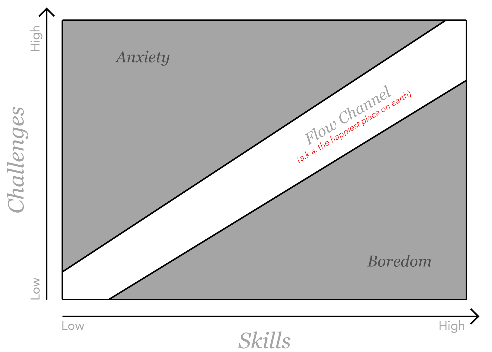
In this state, you lose track of time, and you lose track of external goals. You are doing the task for the sheer pleasure of doing it. It is an autotelic experience. It is intrinsically motivating. The task itself is the motivation; not the result of it. In this state, you can do 10x more. You are more productive and happy. This is optimal experience.

You get “in the zone”.
That’s what they’re referring to in The Social Network when Justin Timberlake (playing Sean Parker) almost interrupts a developer and is stopped, because they’re “wired in”.
You may be wondering: what does this have to do with product design?
It has everything to do with product design. And not for you the designer, but for your users.
The Importance of Getting Software Design Right
First, why should we care? Why should we go so deep into figuring out how to design software that promotes optimal experience for our users? They’re just “apps”, aren’t they?
Software is the means through which we achieve often monumental accomplishments. Whether we’re writing a book, building a company, or anything else, our greatness is achieved with various software applications often as the medium.
It may just be text on a screen, but often what it means to you is much more significant. It’s your conversations with those you love, those you work with, those you admire, and those you mentor. Sometimes, it’s three little dots that tell you your loved one is safe. It’s often the medium through which you learn to do what you do better. It’s often the medium through which you create your life’s work, and through which you publicize it to the world. It contains the content of our lives.
Through software, we create and interact with the content of our lives. The better the software, the more enriched experience we can have with this content. This is actually what attracted me to software design in the first place.
Ergonomics of Software
As software designers and developers, we have to remember that we’re designing things for humans to use.
Just like a car is built around a human — with a comfortable seat, and controls that were designed around the human body, our software should be equally ergonomic.
Like a pen with a soft grip, or an ergonomic desk chair with adjustable lumbar support, our software should be built around the human.
Further, the tools we use should not interrupt our work. If pens were like most software, they’d run out of ink or overflow on a daily basis. Your ergonomic chair would randomly change your lumbar support setting. You’d be convinced that the makers of the awful pen and the awful chair went to more effort just to make these things frustrating to use. One day, rotating the lumbar knob clockwise would do one thing, then the next day, the knob would just be gone, and the manufacturer would have a blog post boasting an “innovative new interface” that “assumes the best setting for you”. Better, you’d have to dismiss the announcement before you could even sit down.
Our goal has been to make software like the pen: unobtrusive, understandable, predictable. It capitalizes on what you already know about using writing instruments, but can improve the experience in different ways for different people.
One of the most important ways we have to design around the human is by designing around the human’s mind. This takes into account a healthy dose of psychology, which is what makes the principles and conditions of the psychology of flow so important for product design. Our software should enable us to enter a state of flow when interacting with the content of our lives.
Software plays a key role in the psychology of flow, because it represents the interface through which we interact with so much of today’s work. So we have to understand the conditions needed to enter a state of flow — or optimal experience — in order to design products that allow our users to have an optimal experience.
Using Flow to Direct UI Design
Our software interface should promote the conditions needed to enter a state of flow for our users so that they can most freely interact with the contents of their lives, through our software, without being inhibited by its interface. Therefore, we use the conditions needed to enter a state of flow to direct our product design.
Remember that flow requires a challenge, so it’s important to note that it shouldn’t be challenging to use software — we all know what that’s like, and it definitely doesn’t lead to flow. What we’re working on should be challenging, not the tools themselves.
Software should allow us to engage in challenging work using our skills without interrupting us. It’s challenging to write a book, but it shouldn’t be challenging to use text editing software. The content of our lives is what provides the challenge. The software tools we use should get out of our way to allow us to take that challenge head-on. To do this, it has to maximize on our existing skills, just like the pen, so that it feels invisible; we forget it’s there. The user brings the challenge, the software should intuitively allow us to engage the challenge.
Note: this is different for games, where the game itself does have to provide the challenge.
The 7 Rules
You thought we’d never get here, did you? Oh, you just scrolled right down to here? Got it. Carry on, then. (But there is some pretty good stuff above, too — check it out after you read a few of the rules below and realize you’d like a little more background.)
By the way — if you’re enjoying this article, be sure to hop on my weekly newsletter!
1. Match the User’s Semantics
Reducing the semantic gap between the user and the interface decreases the cognitive burden placed on the user.
To help a user get into a state of flow — or optimal experience, we must decrease the cognitive burden placed on a user when using our software.
We did this with the original concept behind Mail Pilot: we wanted to bring the interface closer to the user’s own semantics, reducing the cognitive or semantic gap, and further away from how IMAP actually works.
Think of it like using a CRM instead of an excel spreadsheet. That CRM has a database on the back-end which would be most easily represented as a simple spreadsheet, but there’s a lot of glue code in between its database and its interface to make it more intuitive for your use case.
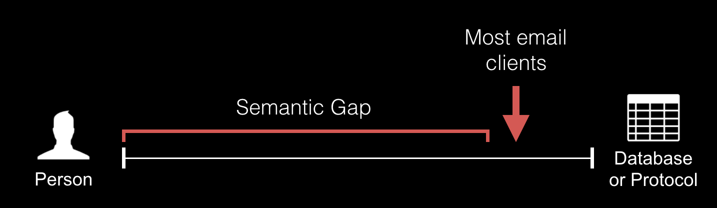
Imagine a spectrum with the person (and how they think) on the far left, and the database or protocol (how the computer thinks) on the far right. Most email clients sit far on the right, exposing the basic functionality from the underlying protocol.
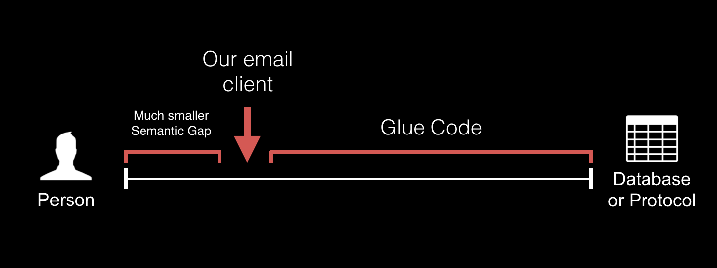
With Mail Pilot, we wanted to move the interface much further to the left; more closely matching how people think about and want to use their email. This does mean there needs to be a lot of glue code in between the interface and how its underlying protocol actually works, but it also means that we dramatically reduce the semantic gap between the user’s psychology and how the interface looks and works.
So we strived to allow users to see and interact with their data the way they think about it. That’s why unread / read became incomplete / complete, and why we brought reminders to the inbox back in 2012.
By decreasing the cognitive burden placed on the user, we end up with a happier user, spending less time, using more powerful tools, more easily.
Consider This
Can your product more closely match how your user thinks about and wants to interact with the information in it? Hint: the answer is yes. The trick is to first empathetically understand your user’s psychology. How do they think about the information contained in your product? How do they naturally want to interact with it? If you get a lot of one-off feature requests for strange things that you don’t think fit in the intended workflow, ask users why they are requesting those features. You’ll probably find a gap between how they want to interact with their information and how your product works.
2. Require as Few Interactions as Possible
Infer a lot, otherwise tasks become mundane
An easy way to lose flow is to be bored or apathetic. When a user has to do a lot of work to get a small result, the work at hand becomes mundane and redundant. They no longer face the challenge of their work, they’re stuck doing data entry.
Figure out as much as possible from as few interactions as possible.
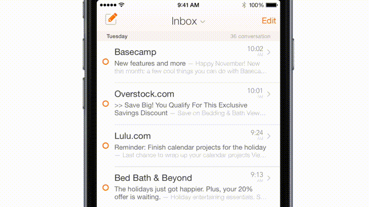
For example, in Mail Pilot, we had a feature where you could set a reminder for an email to come back in the future. On an ordinary interface, this could take 5 taps: open the message, hit a button to set a reminder, select the month, select the day, hit okay. With our mobile app, we needed to require fewer interactions, otherwise people wouldn’t use it while trying to quickly triage their inbox.
We managed to get it down to one interaction. You would simply slide a message further to the right to set a reminder in an increasing number of days (releasing on the number you wanted). See here:
It became one of our user’s most loved and most used features.
Before, users would almost never set a reminder on the mobile — it was too cumbersome — so they would wait until they were on the desktop. What a pain! Once we shipped this “scrubbing” interface, setting a reminder was the second-most used organization on the mobile (after completing a message).
This is also the foundation of what makes Throttle so successful. The basic premise sounds cumbersome: every time you sign up for something new online, Throttle generates a unique, random email address for you to use. This way you can control who sends you email in an airtight way, find out who tries to sell or steal your address, and stop giving out your address online. But it sounds like an intensely cumbersome system to use, even if you do get the stuff out of your inbox that you want to receive but that doesn’t belong there.
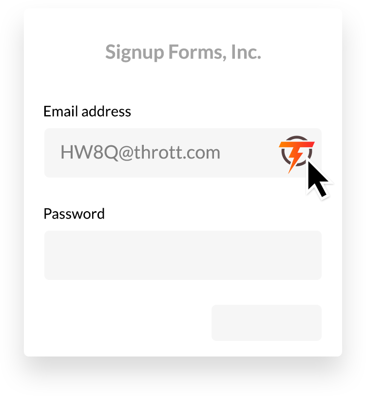
Here’s the kicker though — the genius of it is how you interact with the system. The Throttle browser extension puts a button in all email form fields. To generate an address, all you do is click the button, which is already right in place where you need it — it’s even faster than what you used to do (type your real email address). To read messages you’ve received, Throttle sends a single daily digest email to your inbox at the time you deem most productive. It effectively puts this intense system of hundreds of email addresses all managed for you, right at your fingertips in just two touch points, where you’re already going to be anyway (the form online & your inbox). That’s what makes it work so well. Users don’t have to think about it, remember to check it it, or manage it.
Consider This
How could your app do more for the user with less input? How could the key interactions with your app be closer to where the user already is when they need it?
3. Design a Predictable, Self-documenting Interface
To enter a state of flow, you need to know what to do & how to do it
This is intuitive if you consider that procrastination, when not caused by a fear of failure, is usually caused by not knowing how to get started.
So, we need a predictable, self-documenting interface. How? Here are two examples from our email client:
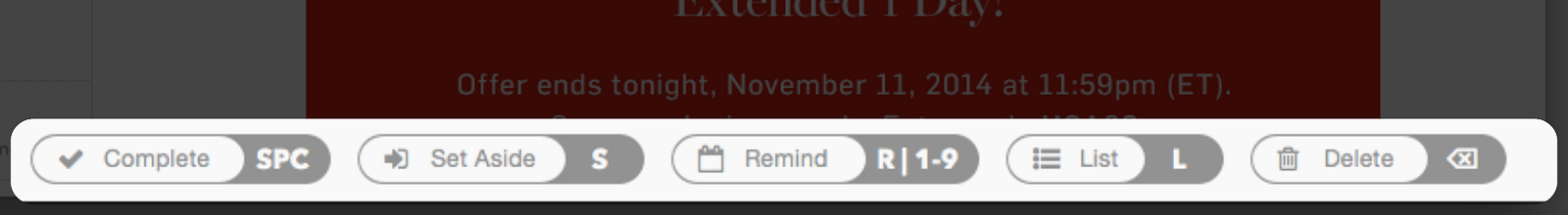
First, the bar below each message featured all the buttons you could use to organize your message. But each button also had its keyboard shortcut on it. This was a minor UI tweak — it required no new functionality — but it was a fan-favorite feature when we launched it in beta. It made the efficiency of keyboard shortcuts — previously reserved only for the most die-hard power users — accessible to everyone.
People that had never been keyboard shortcut people before were whizzing through their inboxes.
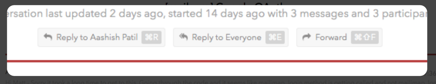
If you’ve ever been stuck on a reply-all chain, you’ll appreciate this. Nowhere in Mail Pilot did the words “Reply All” appear. Instead the buttons said “Reply to [Name]” and “Reply to Everyone” so you knew exactly what you were doing.
We cannot stay in a state of flow if we are dealing with interruptions. Interruptions can be things like unnecessary notifications, sluggishness, or bugs, but they can also happen when users are simply unable to do the one thing they’re trying to do. If they can’t find the one button, all they want to do is bold some text and get on with their work, but they can’t figure out how — that is a massive interruption.
Consider This
Where does your product’s interface need to be better self-documented and more predictable? How could you enable most users to leverage features you think of as being only for power users? Where are mistakes made in your app often, and how could the interface more clearly communicate to avoid these mistakes or confusions?
4. Provide Clear, Reachable Goals
In order to enter and stay in a state of flow, the user has to have an attainable goal, and always know their progress towards that goal.
If you don’t feel like there’s a chance you can reach a goal, you won’t engage in it.
We encounter this regularly in the inbox:
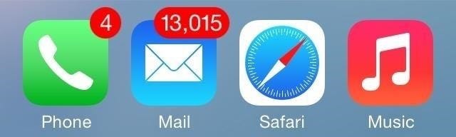
There’s not a chance you’re reaching this goal — reading 13,000 unread emails. So you simply won’t engage in it.
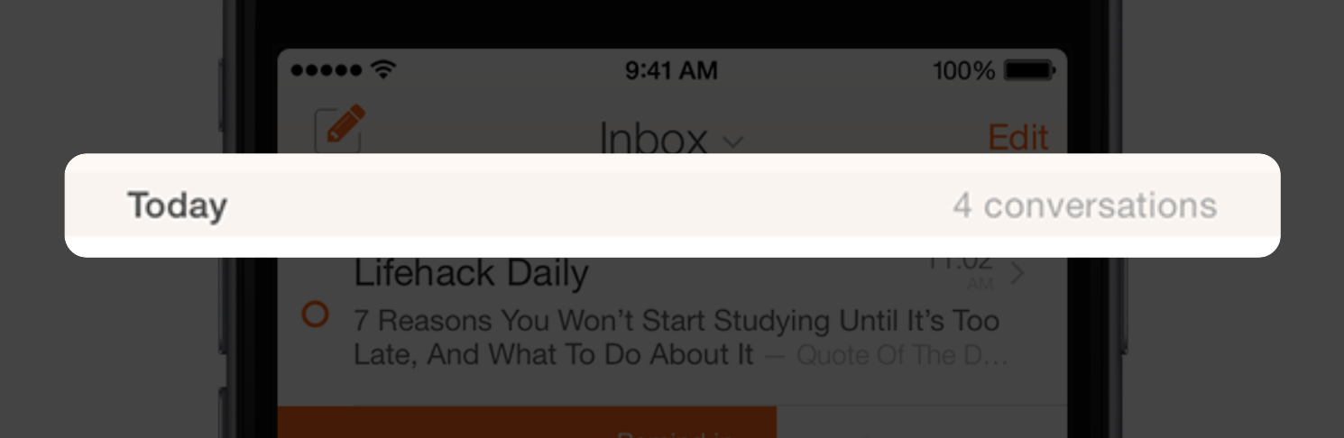
Instead, in Mail Pilot, we never showed a “total unread” number. Instead, we showed how many emails you received that day, and we grouped the inbox by day. This way, you had a clear and reachable goal: read the 7 messages you’ve received today. And maybe once you’re done with that, you might do the 10 you received yesterday.
Much more achievable.
Consider This
Are you giving your users an unclear or unattainable goal? How could you break it up? Do your users always know their progress toward their goals? How could their progress be better communicated?
5. Reduce Clutter
Users need freedom from distractions and interruptions
A necessary ingredient for staying in a state of flow is freedom from distractions. Interruptions break us out of flow. So in our interfaces, we strive to reduce any clutter around the content of our users’ lives so that our users can focus on the task at hand.
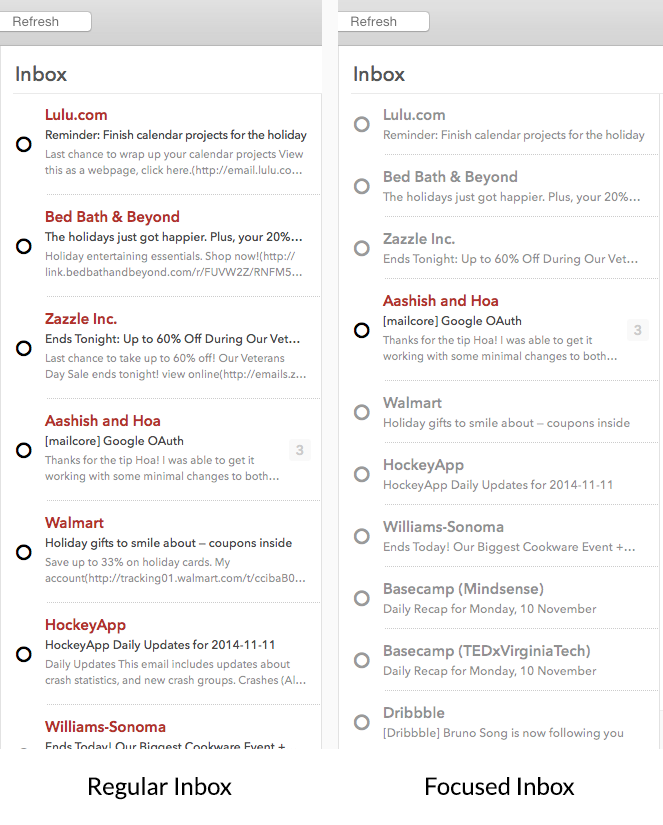
Here’s what we did in Mail Pilot. Notice on the left a regular inbox. A bunch of emails from companies, newsletters, notifications, and so on. But there is one email from a person — Aashish — continuing a conversation about Google OAuth. Mail Pilot figures out which emails were sent by computers, versus those sent by an actual human opening up a compose window and typing a message. It then collapses & deemphasizes the former (as seen on the right).
This brought a totally new level of focus to the inbox. It was a little-known feature that was off by default, but it was a game-changer for those that chose to use it.
This made our next product all the more compelling. Throttle keeps these kinds of messages from hitting your inbox at all. So instead of having to look through the highlighted emails, scrolling past those that were de-emphasized, you never received the latter at all. Not in your inbox, anyway — you could read them in your reading list online, or set up a single daily digest email with all of them in it, keeping things focused. Throttle brought this great feature to everyone — regardless of what email client they use.
It then gives you a reading list that generates full previews of all messages received — making those mass mailing emails rich with images far easier to scan when you’re looking to see if anything is of interest:
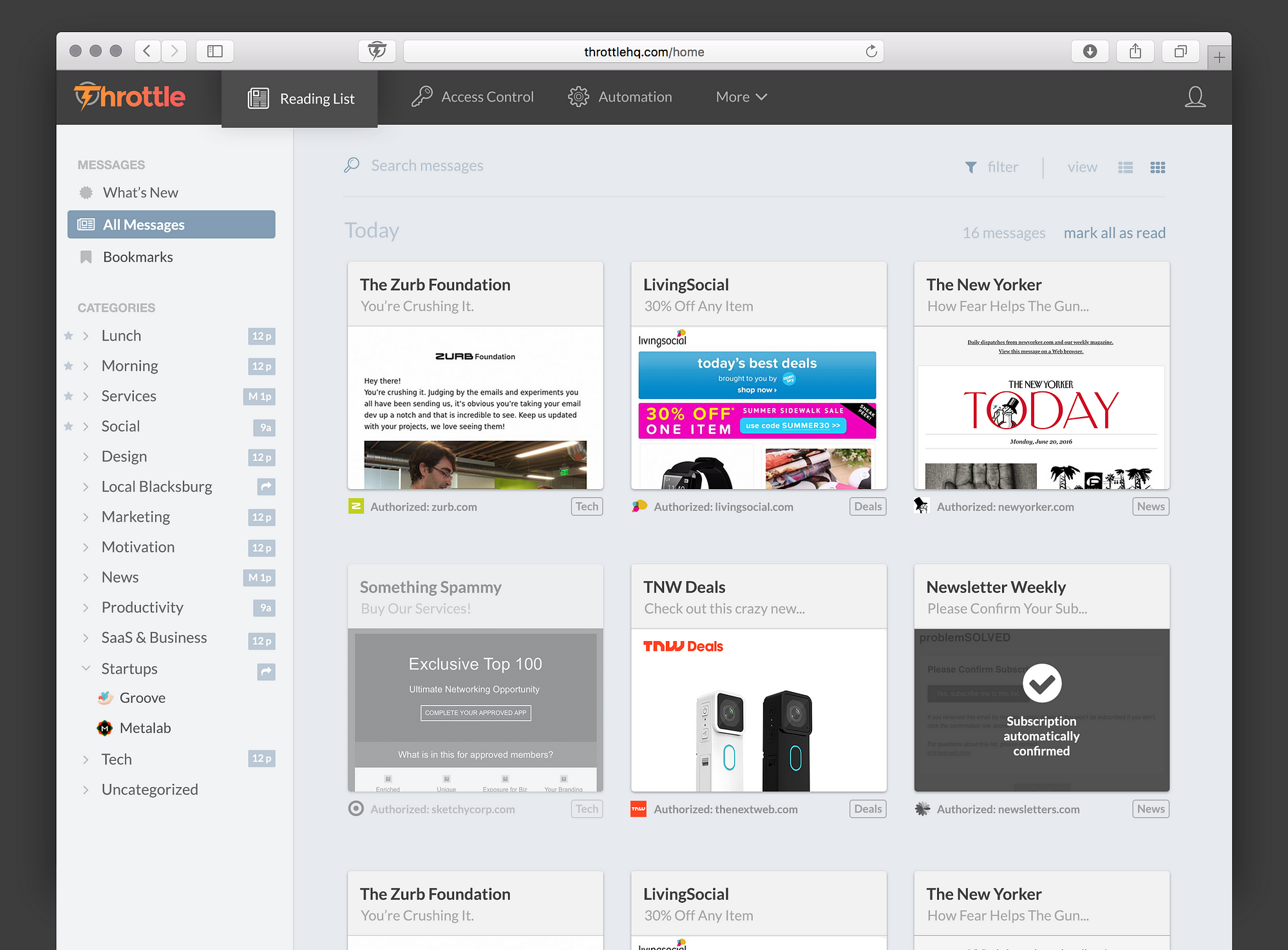
This effectively turned yesterday’s clutter into a far better experience, and more importantly, outside the inbox and away from the important conversations you have in it.
Consider This
How can you reduce the clutter in your application? What disrupts your user’s workflow? What does your user most care about? Can they easily scan for it?
6. Give Immediate Feedback
Waiting is the death of software
Ever clicked something and wondered if the app your were using notice or cared? Immediate feedback is necessary for entering and maintaining a state of flow.
Here’s a slick way we gave clear and immediate feedback in our app:
When you set a reminder, instead of a button that says “Okay” or “Set Reminder” to confirm, the text of the button changes depending on what you have selected to say “Remind Tomorrow” or “Remind in 1 week”.
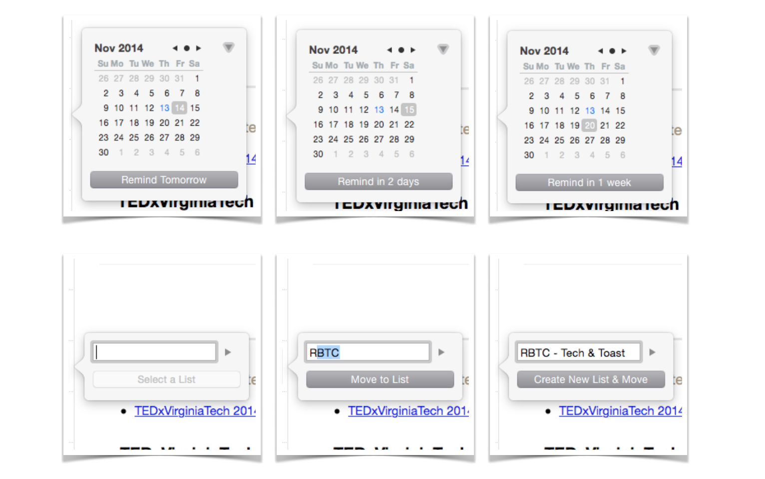
You know exactly what you’re doing, you know that the app knows what you want, and you know what’s going to happen when you click the button.
Same with lists — if you typed a list that exists, the button says “Move to List”. But if you type something that isn’t a list yet, it says “Create New List & Move”.
Consider This
Does your app fail to give immediate feedback anywhere? Could it give feedback before any actions to improve clarity and confidence?
7. Design an Intentional and Empathetic Navigation Structure
You have to know where to go to flow.
Knowing where you’re going and how to get there is necessary to enter a state of flow or optimal experience.
This is why you enter autopilot when driving home, lost in your own thoughts (flow — because you know where to go), but when you’re driving somewhere new you have to turn the radio down as you look for your destination (distinctly not flow).
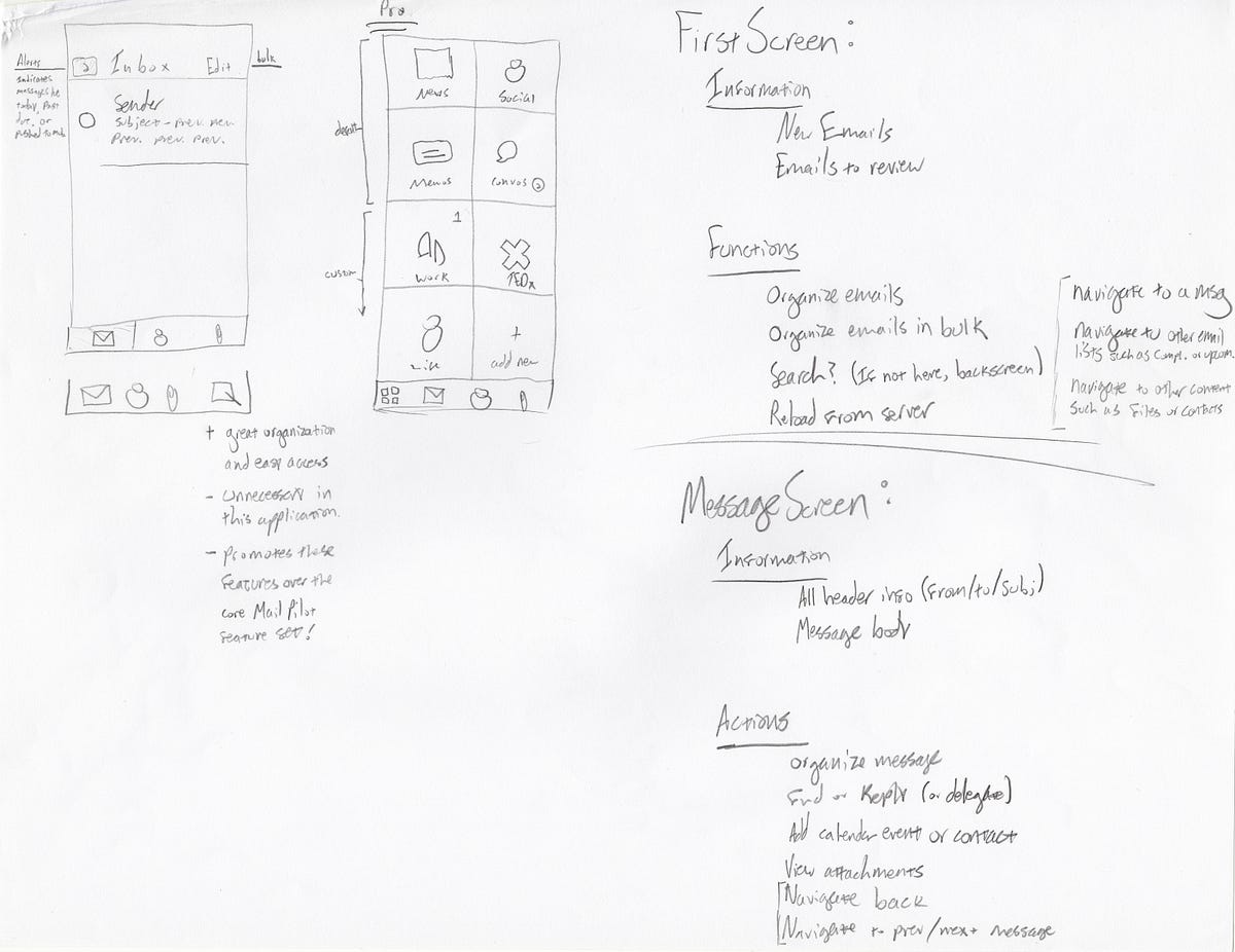
The navigation structure — especially on mobile — is the foundation of any app. If this isn’t right, nothing will be. It’s the very first thing we design when we design a new app.
Let me give you a deep dive to show you what I mean, with our email app.
It’s important to know that before designing anything, we had to learn a ton about how to bring our web app to the mobile. Just because we figured out how email should work better didn’t mean we knew how people could best interact with that concept on the mobile.
We learned that people triage on the mobile: they live almost entirely in the inbox, working to clear out the junk as it comes in. They do their heavy lifting on the desktop (organizing, writing long replies, etc.). They would only organize on the mobile with interactions that required 2 or fewer gestures.
On the off occasion they left the inbox to reference something, they always wanted to quickly get back to the inbox.
All of this is completely backwards to how the traditional mobile email client navigation system was designed — it was a quick remapping of how email worked on the desktop, brought to the mobile. A designer solely after aesthetic appeal would simply take this basic navigation system without giving it any research or thought, and make it look nicer.
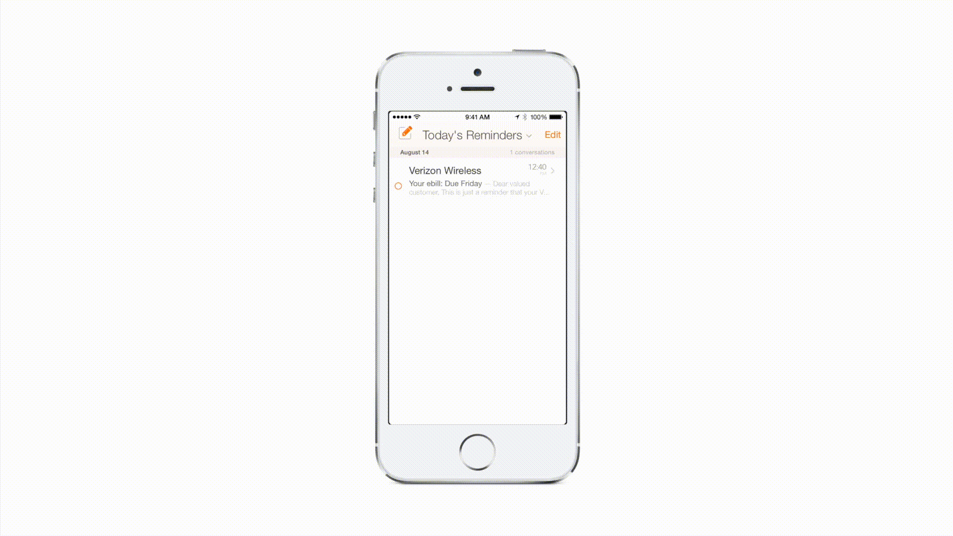
As we embarked on bringing our popular email client to the mobile, we looked at this traditional navigation structure found in the stock iOS email app:
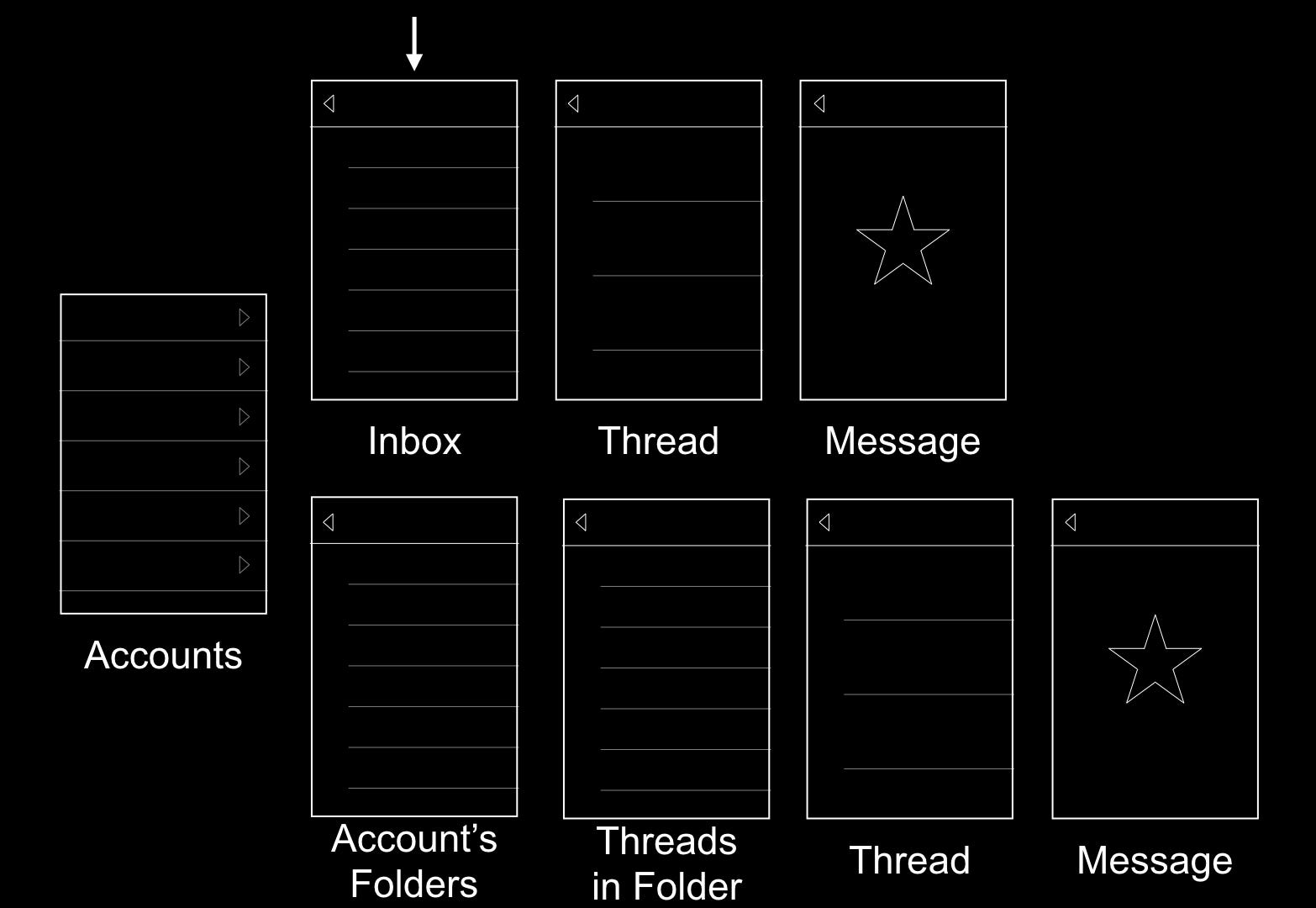
So you’ve got a list of accounts, leading to an inbox. But when you launch the app, you want to start in the inbox. Which means when you launch the app you already have a back button even though you haven’t gone forward yet. Things are starting to break down a little.
Now let’s say you’re in a message, maybe you’re going to reply, but you need to check something in a message in another folder. You hit 3 back buttons to get to your list of accounts, then 4 to drill down to a message inside a folder. Now all you want is to go back to the inbox, that’s another 5 taps.
12 total interactions on your round-trip. “Can’t this be smarter?” we thought. We know that the user lives in the inbox on mobile, and just wants to triage.
I sketched out a ton of options. How could we design an intuitive navigation system that quickly gets you back into the inbox from anywhere? And how could we design it around the fact that you start in the inbox, but need to go a hierarchy level up or down at different times?
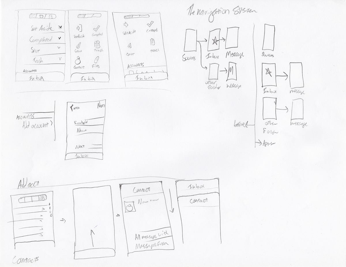
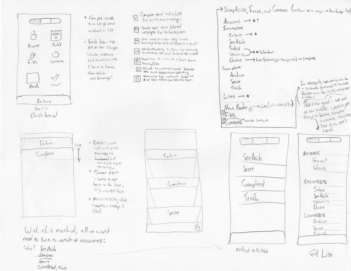
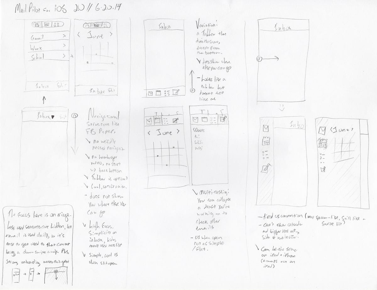
After much deliberation, it was clear we needed to dust off the old z-axis. We needed to break this strictly linear notion from the traditional navigation structure so that (maybe counter-intuitively) we could make it simpler, faster to navigate, and more honest.
I landed on the idea of having a “backscreen” behind the inbox, and having opened folders slide up as windows above the inbox. Dismissing them just meant sliding them back off of the screen, taking you back to the inbox.

Here you can see it in action:
Now getting back to the inbox is a breeze. It does take a little onboarding, but there are little cues in the UI to get you up to speed even if you skip the onboarding. The use case people had on the mobile was now much easier — you could get back to the inbox in one gesture from anywhere. Plus, you didn’t launch the app and see a back button.
This also extends to individual components of apps too. Here’s a great example:
In Throttle, we discovered that people were opening their reading lists, opening the first message, and hitting “next” until they had viewed all of the messages that were new (stopping when they recognized one they had already read before). We assumed they were scrolling through their reading lists, but they really just wanted to slide through each new message, and be done.
So for the mobile we designed a “What’s New?” tab:
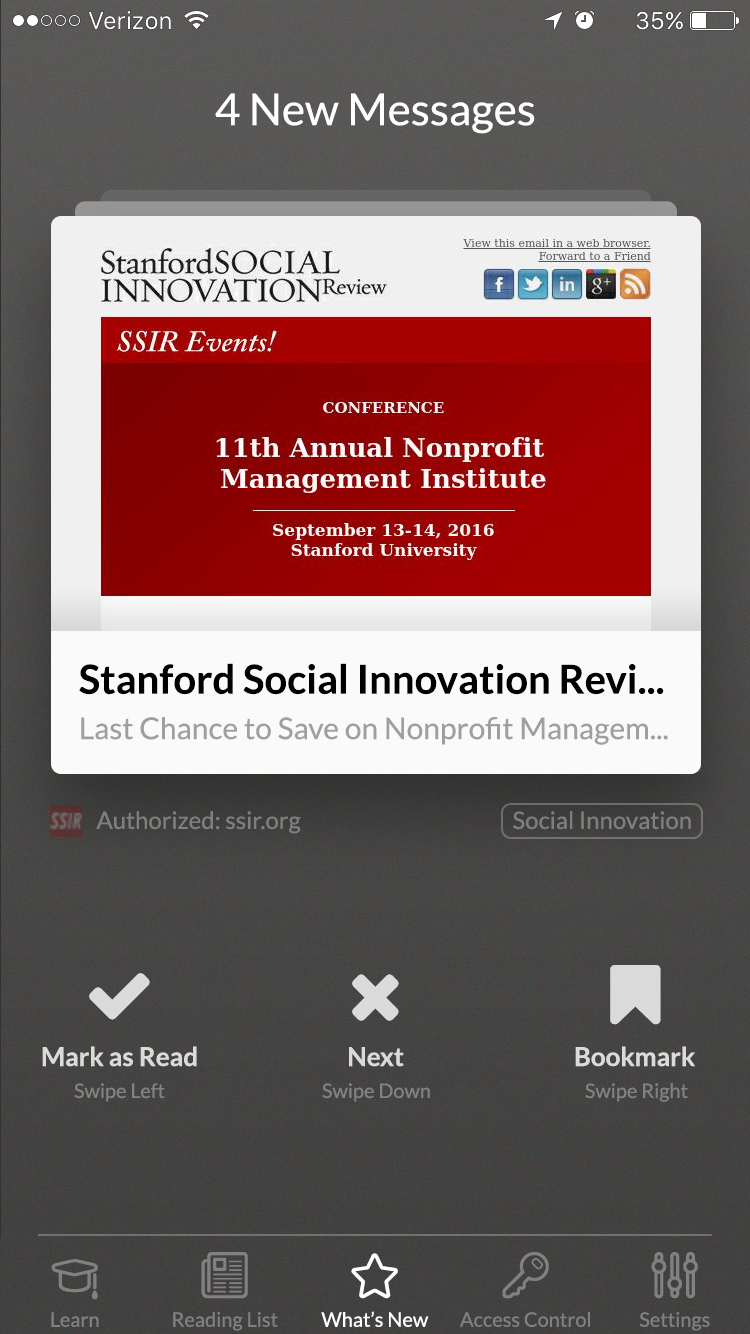
It played right into the use case our users had in their reading lists most often. It allowed them to swipe through each new message, and it only showed new messages. You reach the bottom of the stack when you’ve seen all of the new messages, so you wouldn’t have to remember the last message you saw on your last visit to the reading list. This made the interaction they wanted to have much more natural.
A way to think about a great navigation system is to see if it answers these three questions at all screens:
- Where am I?
- Where can I go from here?
- What will I find when I get there?
By Alex Obenauer